Introduction
This Android Material Design Tutorial discusses concepts and getting started with basic app development using these concepts.
Google announced material design with Android 5.0 (API level 21). It was one of the most publicized and defining feature of Android. As defined by Google, it’s basically a design language. One defining feature of material design is that the design support library is backward compatible and supports Android 2.3(API level 9) onward. We’ll take a look in this backward compatibility feature as well.
Instead of a lot of theory, let’s start with building a simple app and we’ll convert it to use material design. I am hopeful, this way of representation will help learn the subject in better way.
Tech Stack
In this tutorial, we’ll use followings –
Android Studio 2.3.3
JAVA for Android programming
Create an app with Empty Template
- To start with, let’s create an empty app. Launch Android Studio and click: File –> New –> New Project…
- A “Create New Project” dialog box will open; we’ll provide the app name and company domain. I have entered following details, you can provide the name/domain as per your choice and preference.
- Application Name:- ItcMaterialDesign
- Company Domain:- iteritory.com
- Click on Next button. In the next window, select the minimum SDK version; you can choose as per your preference. In this case, I have chosen API 16: Android 4.1 (Jelly Bean). Click Next button.
- In the next window, select “Empty Activity“. Click Next button.
- In the next window, let’s keep the Activity Name and Layout Name to default. Click Finish button.
- Now, run the app using a emulator or directly in a mobile device you have. You will have an app launched with “Hello World!” in the content area.
Which Theme is used? Where the colors are defined?
- If you notice the app, there are three color sheds. In the bottom, there is light colored area where “Hello World!” is written. On top of that, there is a blue colored toolbar were the app-name is written–> “ItcMaterialDesign“. Lastly on the top-most area, there is a darker blue colored status bar where some notifications are visible along with the time and mobile tower. Let’s take a look where this theme and color scheme is mentioned.
- Traverse and open res –> values –> styles.xml. In the XML content, there is a theme named “AppTheme” and its parent is mentioned as “Theme.AppCompat.Light.DarkActionBar“.
- In the parent theme “Light” denotes the app content area where “Hello World!” is mentioned. “DarkActionBar” denotes the action bar/tool bar where we have the app name mentioned in the current app.
- The theme has some color codes mentioned in the theme and these colors are defined in res –> values –> colors.xml.
- colorPrimary : it denotes the toolbar /app bar color
- colorPrimaryDark: it denotes the status bar (topmost area) color
- colorAccent: It denotes the color of various UI elements (like button, check box etc) if there widget colors are not defined explicitly.
- Just to note, the theme mentioned above is NOT a material theme.
Material Theme
We have following material themes available in android –
- Theme.Material : This is the dark version of the theme; see the pic below from google developer page –
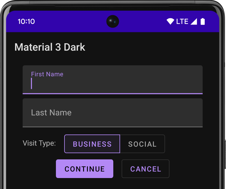
Theme.Material (Dark Version)
- Theme.Material.Light: This is the lighter version of the theme; see the pic below from google developer page –
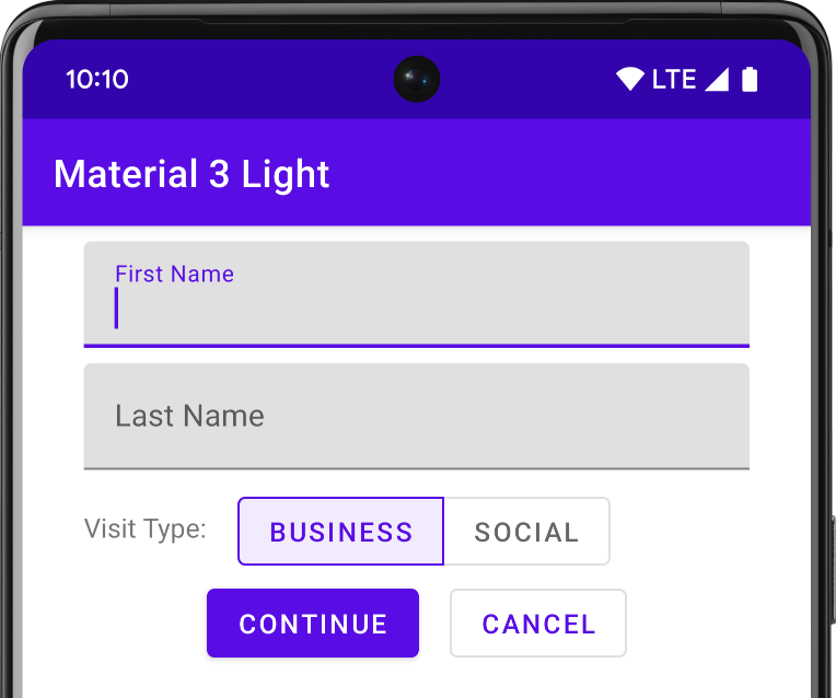
Theme.Material.Light (Lighter Version)
- There are several other variants like Theme.Material.DarkActionBar, Theme.Material.NoActionBar etc.
- Now, we’ll make our traditional app use a material theme; say for example Theme.Material.Light. So, traverse and open res –> values –> styles.xml.
- Change the parent to “@android:style/Theme.Material.Light” and save.
- Now, you will notice an error underlining just below the parent theme name. If you hover your mouse over there, you will see an error message like below – “`@android:style/Theme.Material.Light` requires API level 21 (current min is 16)“. But why so?
- Remember, while creating the app, we selected minimum API level as 16. So, this essentially means that this theme is compatible only with API level 21 or above. But it’s incompatible with any below API level 21. So, what do we do in such scenarios? Well, Read on!!!
Backward Compatibility Setup
To support apps with older API levels ( API 7+), google released AppCompat V7 r21. This manages material design backward compatibility. When we create a new project in Android studio, it already resolves a dependency on AppCompat V7 library. You can check the same in build.gradle (Module: app) file. Please verify the support library is release 21 or above. In my case it is 25; the corresponding dependency declaration is –> compile ‘com.android.support:appcompat-v7:25.3.1’.
The following table gives us the related backward compatible themes for the material themes. You can derive the backward compatible theme names by generally replacing the Material with AppCompat.
-
API 21+ API 7+ Theme.Material Theme.AppCompat Theme.Material.Light Theme.AppCompat.Light Theme.Material.NoActionBar Theme.AppCompat.NoActionBar
- Traverse and open res –> values –> styles.xml. Change the theme content like below. You can customize the theme mentioned in this file for all older devices before API level 21. If you notice, we named the theme as ItcMaterialDesignTheme.
<resources> <style name="ItcMaterialDesignTheme" parent="AppTheme"> <!-- customize theme for older device --> </style> <!-- Base application theme. --> <style name="AppTheme" parent="Theme.AppCompat.Light"> <!-- Followings are applicable for apps accross API levels; new or old. --> <item name="colorPrimary">@color/colorPrimary</item> <item name="colorPrimaryDark">@color/colorPrimaryDark</item> <item name="colorAccent">@color/colorAccent</item> </style> </resources> - Now, we will have to create styles.xml for all devices with API level 21 and above. For that, we will create a new folder values-v21 (under res) and place the new styles.xml. Right click on res folder –> New –> Android Resource File. A dialog box will open; fill it up like below.

android-styles-xml-file-for-newer-device
- Then open the newly created styles.xml in values-v21 folder and modify like below –
<?xml version="1.0" encoding="utf-8"?> <resources> <style name="ItcMaterialDesignTheme" parent="AppTheme"> <!-- customize theme for newer device --> </style> </resources> - Next, we will add new theme to android manifest file, so that android knows which theme to apply for the app. The android manifest file will be like below after adding the new theme file. The only change we made is in the value of “android:theme” attribute.
<?xml version="1.0" encoding="utf-8"?> <manifest xmlns:android="http://schemas.android.com/apk/res/android" package="com.iteritory.itcmaterialdesign"> <application android:allowBackup="true" android:icon="@mipmap/ic_launcher" android:label="@string/app_name" android:roundIcon="@mipmap/ic_launcher_round" android:supportsRtl="true" android:theme="@style/ItcMaterialDesignTheme"> <activity android:name=".MainActivity"> <intent-filter> <action android:name="android.intent.action.MAIN" /> <category android:name="android.intent.category.LAUNCHER" /> </intent-filter> </activity> </application> </manifest> - Now run the app and you will have your first backward compatible app that is running material design theme.
Reference Figure
As you might have noticed, we used 3 material design attributes in the above demonstration. There are several more attributes that we can use in our apps as per requirement. Following figure is referenced from google developer portal with some comprehensive list of attributes –
-
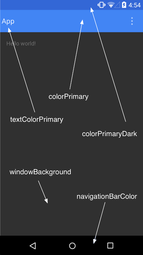
Various Color Attributes


HackerX
January 25, 2018Good Job man. Appreciate your efforts. ?
Sadruddin Md
January 26, 2018Thanks mate